COMMUNICATE IN WAYS
UNIMAGINED?
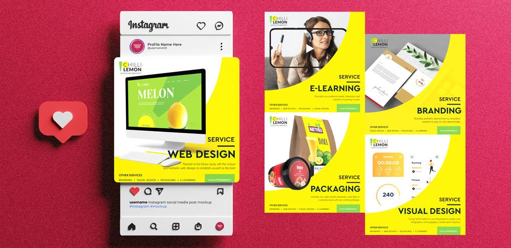
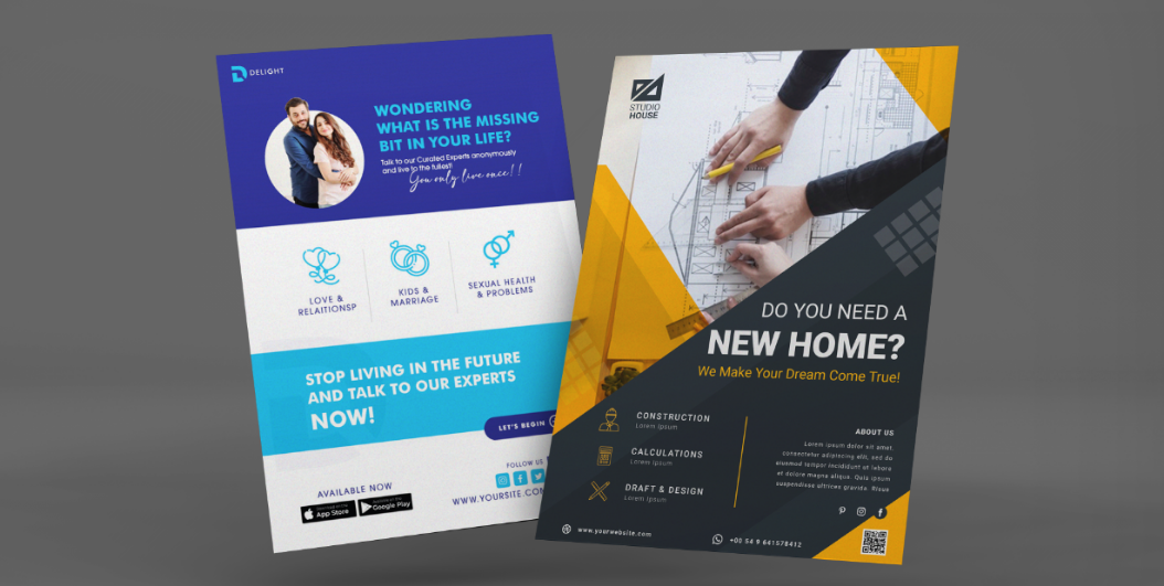
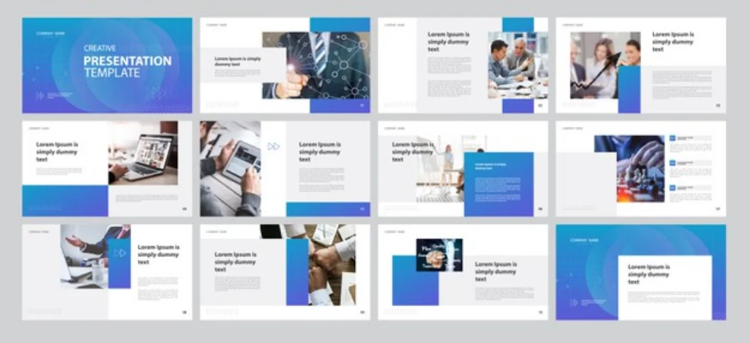
Giving 'WOW' effect to your infographics, social media, emailers, presentations, flyer, brochures, and other promotional materials.

Giving 'WOW' effect to your infographics, social media, emailers, presentations, flyer, brochures, and other promotional materials.
Check This
Out
Without good design, even the best, most compelling story is lost. We at Chilli lemon ensure that your visual communication is both beautiful and effective. We use no more than five colors in a single layout and make that it is used sparingly to highlight important information. Likewise, we try our best to present content in a way that guides readers through in a logical hierarchy, we also align the elements in a layout with each other to maintain consistency.
We use callouts sparingly to highlight only key information, and make sure that the illustrations match tone and subject and are included only if they enhance the content.
We make sure that all fonts are legible and appropriate for the communication style. We keep it a practice to not overwhelm the reader with multiple graphs of single data points.
We know that the eye can be deceiving; therefore we make sure that items are appropriately sized in data visualizations so as they do not skew data. We know that when too much information is in a layout, messaging becomes cluttered and incoherent. Furthermore, we have vowed to use icons that are simple, easy to understand and universal; and they enhance comprehension rather than create a distraction.
We mostly avoid unnecessary design, including 3D charts, ornamental illustration or extraneous elements to keep the creative simple and appealing. We always keep the placement of elements in the text in a way that it influences the meaning of the image and makes it easily understandable.